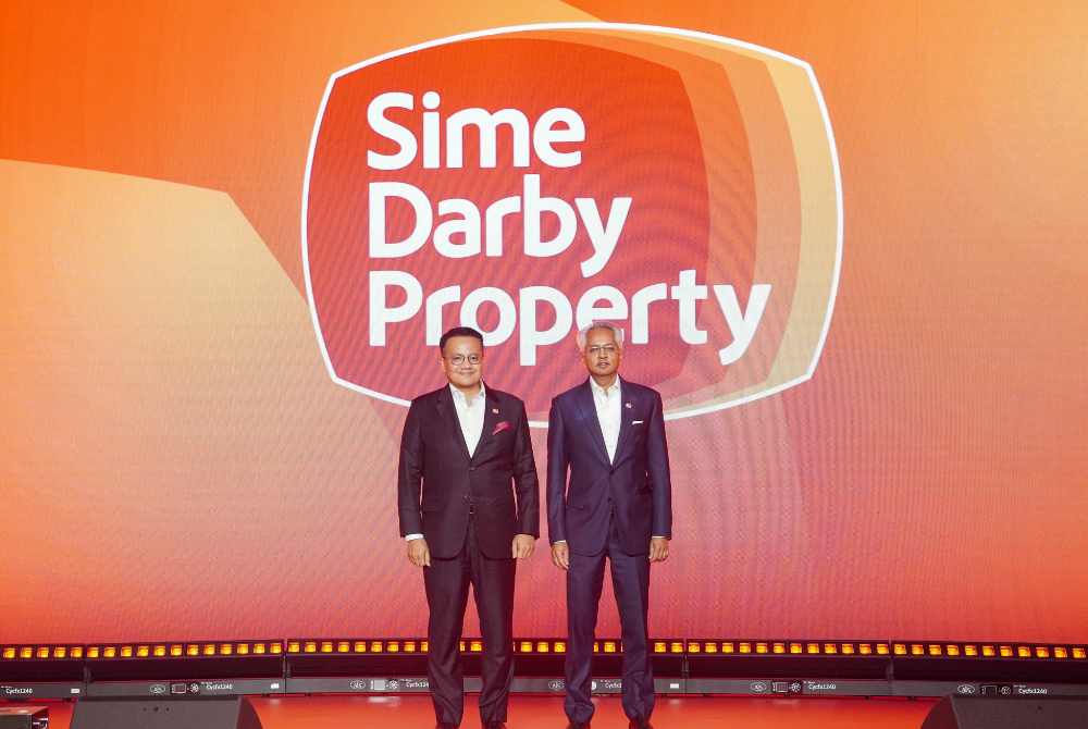
Sime Darby Property levels up with fresh identity
The refreshed look is not about starting from scratch; it is about levelling up while holding onto the values and trust that made Sime Darby Property what it is today.

KUALA LUMPUR - Sime Darby Property just hit refresh on its brand and it is giving major heritage meets modern vibes.
The iconic developer, best known for shaping townships from Taman Melawati to the City of Elmina, has rolled out a new identity that keeps its roots intact while stepping boldly into the future.
The relaunch, unveiled at Sime Darby Convention Centre, yesterday, was not just about a new logo. It was a full-circle moment, bringing together employees, partners and even past leaders who have helped build the Sime Darby Property story.
So, what’s different? The company kept its three OG brand assets, the Sime Darby Property name, its signature shield and that unmistakable heritage red. But the way they were presented was sleeker, sharper and designed for today’s audience.
The new logo featured an outward-flowing design, inspired by their four team values and splashed in red and yellow tones that nodded to the brand’s long history.
The group's chairman Datuk Rizal Rickman Ramli said the brand refresh reaffirmed their identity as a trusted leader and nation-builder.
"This brand refresh reaffirms our identity as a trusted leader and nation-builder. It respects our rich heritage, which combines the legacies of Guthrie, Golden Hope and Sime Darby, while positioning us for a future defined by resilience and purpose-driven growth.
"It is a strategic evolution to ensure we continue delivering sustainable value for all stakeholders," he said.
For group managing director and chief executive officer Datuk Seri Azmir Merican, this was not about tossing out the past; it was about staying relevant in a fast-moving world.

"Our story is rooted in legacy and nation-building, stretching back more than 50 years in property development. From Sime UEP to today’s Sime Darby Property, our DNA has always been about creating townships that endure and communities that thrive.
"This brand refresh is not about wiping the slate clean; it is about ensuring our brand remains relevant, trusted and future-ready. By retaining the core elements that hold the strongest equity, our name, our shield and our colours, we are reaffirming our purpose: To be a value multiplier for people, businesses, economies and the planet," he said.
The rebrand tied neatly into their Shift25 strategy, now in its final stretch. Sime Darby Property was carving out its space as an urban solutions provider, expanding into industrial and logistics projects and even diving into the data centre scene at Elmina Business Park.
With more than five decades of experience (and over 200 years of legacy from Guthrie, Golden Hope and Sime Darby), the company has delivered 100,000+ homes across 26 active townships, serving over 300,000 Malaysians.
Think Bukit Jelutong, Bandar Bukit Raja, Battersea Power Station in London, the list of landmark projects is long.
The refreshed look is not about starting from scratch; it is about levelling up while holding onto the values and trust that made Sime Darby Property what it is today.
Download Sinar Daily application.Click Here!


